A lot has been written about '88 Score and their unique colors and design. I don't have much to add, other than I really like it. I remember finding packs of these at a drug store in the middle of Nebraska when my family was on vacation to visit my Great Uncle. On the same trip I discovered Sportflics, but that wasn't nearly as satisfying. The oddest part of the '88s to me is their lack of team name or logo on the front. '89 added the team name to the fronts, but even so it's not terribly identifiable. I've always liked logos on the front for whatever reason, but I have no problem overlooking it for '88 Score.
All that being said, I'll start with the blander '89 Score.
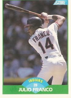
How any card manufacturer ever resisted using a photo exactly like this one for a Franco card is beyond me. Nothing says Franco like this stance. Very clean card and a great photo. My favorite from this pack, by far.
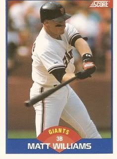
I never realized that Matt Williams was the third overall pick in the 1986. He always seemed like an extremely intense beer league softball player to me.
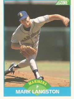
1989 was the year that the Expos made the decision to trade Randy Johnson for Mark Langston and a few others. They got 24 games out of Langston before he came to his senses and made his way to Anaheim. Along with Finley, Langston was part of the lefty duo that made the mid '90s somewhat bearable, at least on the mound.
Now onto the more iconic and enjoyable 1988 Score.
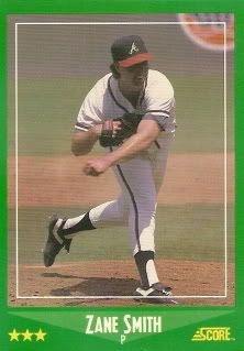
Zane Smith was a decent enough pitcher, he did stick around for a number of years, but I hated this guy's buck teeth. It's almost like it was impossible for him to keep his mouth closed. His teeth are always poking out between his lips. Because of this, I have always despised Zane. I'm shallow, I know.
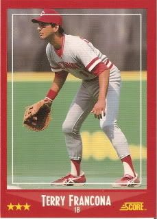
Tito's boy. I guess he manages or something these days. Whatever.
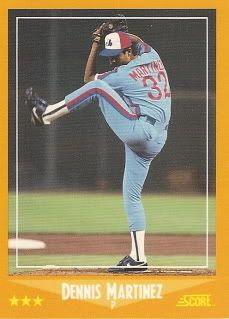
El Presidente. What's not to like about this card? The border color completely clashes with the card, but it works. Martinez is rocking the baby blue uniform, the tri-color hat and his in coiled up pitching motion. Almost card, very good pitcher.
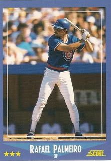
The red borders look nice with red uniforms, but nothing beats the blue on blue. Raffy, pre-scandalous end to his career. In '88 Raffy actually made the All-Star team for the first time, although I'm not entirely sure why. For the year he hit .307, but only had 8 home runs and 53 RBIs. Perhaps he had all of those numbers by July and I'm just not recalling this. Odd.
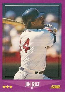
First of two Hall of Famers. I never really appreciated Jim Rice as a Hall of Famer and I'm still not sure whether I regard him as HOF caliber, but one look at the stats on the back does reveal that this guy had some monster seasons. Even so, he was definitely aided by the steroid backlash.
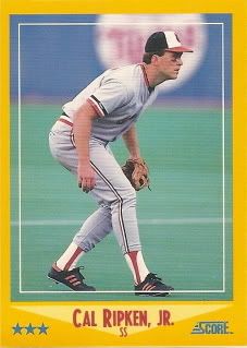
The second Hall of Famer is a great looking card. Again the border color doesn't really work, but it just doesn't matter. I miss the old Orioles hats and logo. I'll never understand why the decided to abandon the cartoon Oriole for the one that looks like it came straight out of a book on ornithology. Cool card of Cal creeping in on the carpet. I like alliteration.
So that does it. The craptacular pack break is over. I definitely miss this innocent side of collecting and find myself drawn to it more and more. That being said, I was at Target this morning like many other bloggers hoping the 2009 Topps had hit the shelfs. I need my up to the date fix!
Go Halos!



No comments:
Post a Comment